Build Beautiful Interfaces Faster with Shadcn UI Kits
Explore a growing collection of components, themes, and dashboard templates built with shadcn/ui and Tailwind CSS. Save time, ship faster, and customize every detail.
Latest Components
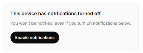
Notification Banner
A notification banner with a customizable title, description, and button. Perfect for displaying important messages.
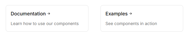
Link Grid
Responsive grid component for displaying clickable link cards with optional header sections.
Animated Blur Text
Animated text component that reveals words with a blur effect.
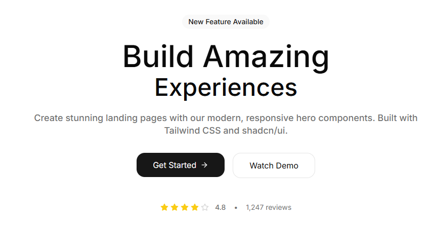
Centered Hero
Classic centered hero section with badge, title, description, and call-to-action buttons. Perfect for landing pages.
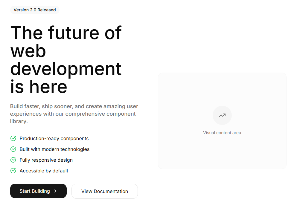
Split Hero
Two-column hero layout with content on the left and visual space on the right. Includes features list and stats.
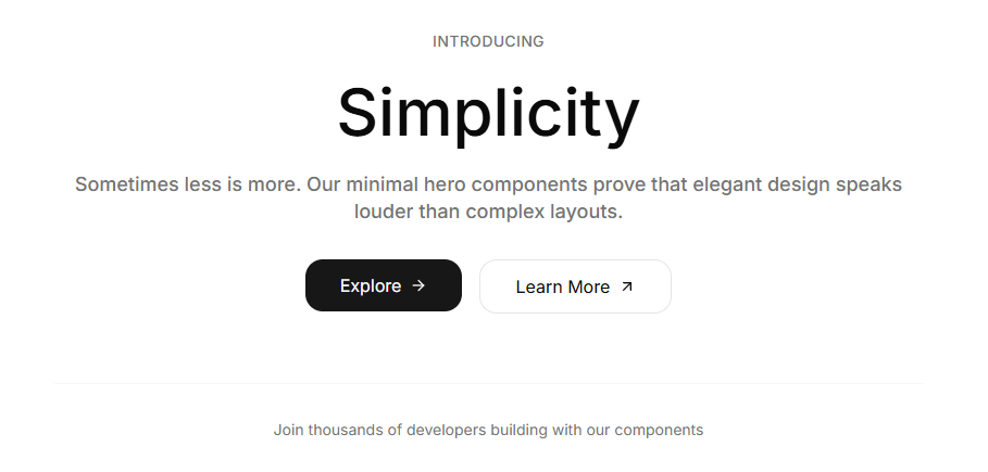
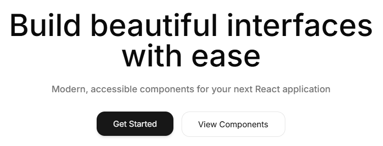
Minimal Hero
Ultra-clean, minimal hero section focusing on typography and simplicity. Perfect for modern, sophisticated designs.
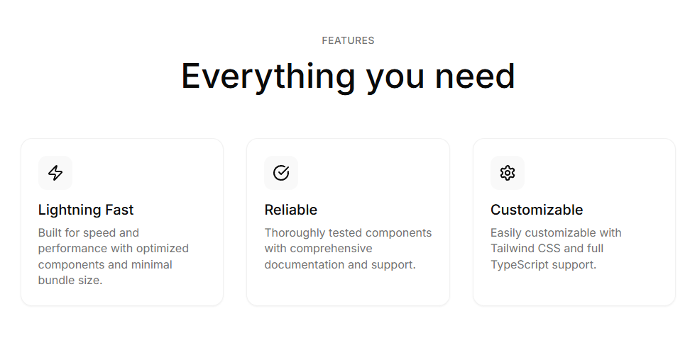
Grid Features
Clean grid layout for displaying features with icons, titles, and descriptions. Responsive design with customizable columns.
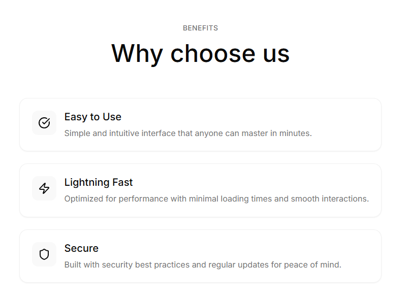
List Features
Vertical list layout for features with icons and descriptions. Option for single or two-column layout.
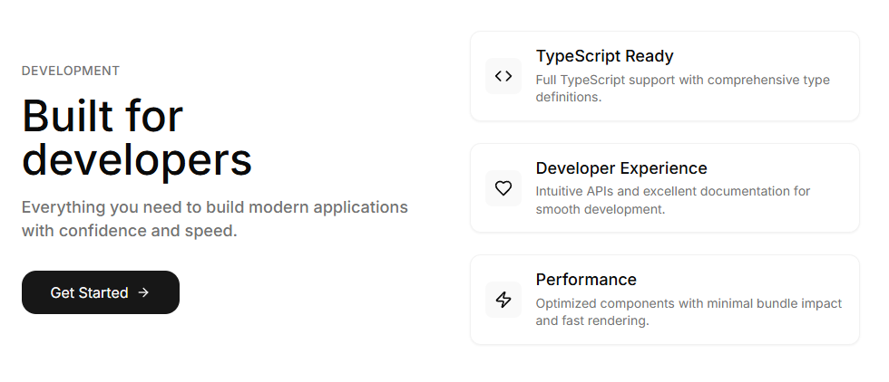
Compact Features
Split layout with content on left and compact feature list on right. Perfect for landing pages.
Simple Footer
Clean, centered footer with brand, tagline, navigation links, and social media icons.
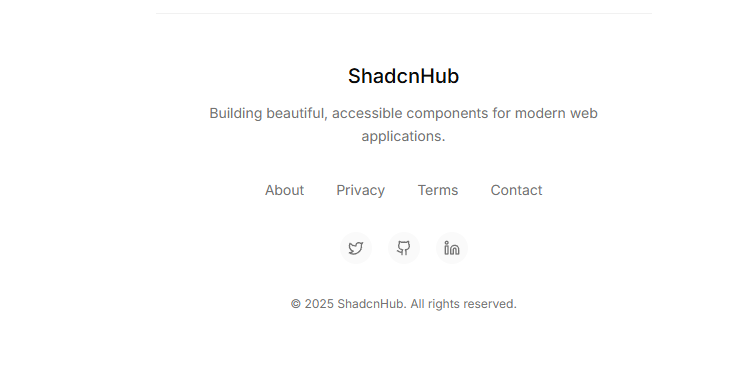
Multi-Column Footer
Comprehensive footer with multiple sections, contact information, and optional newsletter signup.
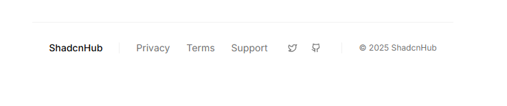
Minimal Footer
Ultra-clean, single-line footer with brand, links, social icons, and copyright in a horizontal layout.